Simple notes with a nested structure
TLDR: This is the story of what brought me to build a note taking tool called Zenkan after not being satisfied by either the simplicity of Google Keep or the weird depth of Notion. In the end, I ended up with a simple and visual canvas drag and drop note-taking tool with 3 levels of nesting.
My messy notes and the app carousel
I've never been a huge fan of taking notes. I don't usually take many notes, and when I do, they're usually messy.
I've used on and off OneNote, Notion, Google Keep and Obsidian.
For the most part, I used Google Keep and Notion. Google Keep for my short notes, thoughts, quick insights, reminders, and Notion for longer amalgamation of notes about themes or projects.
Google Keep is very minimalist and is enough for most of the small isolated pieces of thought that I need to hoard somewhere. But that's also the problem, it's a big pile of random things without any structure.
When structure hides information
In the contrary, Notion is very structured, and understanding how all its pieces articulate with each other is actually quite an undertaking. I've never truly mastered Notion, especially how weird their databases work. I was expecting my tables to be something as simple as a Google Sheet, but instead I witnessed the most unintuitive and complex UI logic I've seen in my life. I had the naivety to think that tables in software should be simple. Notion databases are just not. I didn't get passed this hurdle because there is a part of me that secretly despises and therefore rejects what they did here with their "database" concept.
I still liked how you could structure your pages in Notion, and how it could allow you to create an infinite scaffolding of informational relationships.
Still, the fact that everything is hidden behind a link that you need to click, that you need to "enter into", was a bit tiring because I was never sure how much information I had previously gathered anywhere. I don't have a good enough memory to remember everything I've stashed all around my Notion. Progressively, information started to become more lost, more scattered. Redundant information also started to appear in multiple places because I was not able to quickly tell where each knowledge piece was. It was my fault, sure, but at the same time it became obvious how this tool was not compatible with me. At some point, I wished there was something like a middle ground between Google Keep's simplicity and Notion's depth.
Since I was wondering what I could build as my first full stack web application at the time, I decided around this time to build this very thing that I wish existed.
Zenkan for open visual simplicity
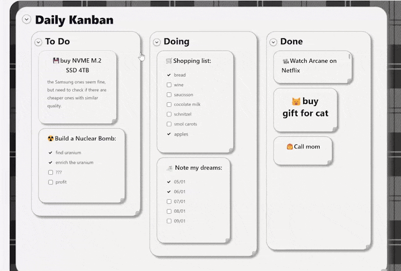
Zenkan takes a radical approach about note-taking: displaying a unique canvas with a fixed 3 level nesting of note cards with flexible drag and drop + auto-ordering. There are no infinite workspaces to put your infinite mess into. Everything is ALWAYS right there in front of your eyes on the same page. You can't escape it, you have to organize your notes, otherwise this beautiful canvas will remind you every day how much you suck at organizing your notes. It's intentional. You can still fold the bigger container cards into smaller pills, but it doesn't make them disappear. They only disappear when you delete them for good. In a way, it's very similar to a physical object that you would have on your wall. When on display, you can't forget what you did, it's right in front of you, it's forcing you to judge yourself and how you organize things. It's a violence in a way, but it's also a way to confront your own shortcomings when what you see on the canvas doesn't please you.
Seeing all your thoughts at once
Other than confronting you, this kind of interface, with its dynamic and persistent feel, also just allows me to more easily lay out all my ideas, my notes, and my reflections in a fully 2-dimensional way, up, down, left and right, compared with regular text pages (like in Notion) where you have to follow the traditional up to down flow of a text wall. Here, the boundaries between the different bits of text are customizable, 2D space can be used very flexibly and at its fullest extent. I like that. It makes me freer to arrange ideas, tasks and knowledge all around my screen as I see fit.
Just a little comfy
I also wanted something warmer than just an unpersonal corporate tool to log my notes, because I wanted the tool to feel and behave like a physical tool with its limitations but also its satisfying characteristics. I thought about two things that would make it more alive: drag and drop motions and sound design.
I was very inspired by Animal Crossing for this, as this is a very chill game that I enjoy playing to relax. I feel like this game really mastered the art of making the player feel at home and comfortable, just with good art and good sound design. The UI of this game and how it sounds played a really big part in this impression of mine, and I wanted to reproduce it in my little note-taking app here. It was a bit of a design struggle of mine to choose what to keep and what to let go of. In the end, I chose to settle on a minimalistic round design coupled with lots of small clicking and motion sounds that I designed myself with Ableton. You can disable it if you want, but I usually let them on, with some modulation per sound. It makes the canvas feel more alive.
Making the cards behave
I also tried to add some features that would make managing the note cards size and arrangement a bit easier, apart from the universal resizeability of the cards, I added a "verticalize" button to put all the notes in a "vertical pile mode", a "fit to content" button to make sure any container that got too big for some reason (or bug) can go back to its expected fitted size, or a "back to default size" button, when you want to start fresh after having messed too much with the sizes of your cards. I also added coloring options to the cards if you want to emphasize certain specific cards or containers from others.
I could go on about the other features, but most are described in the Tutorial available on the current top bar of the Zenkan canvas, so you can go there if you want an exhaustive description.
What could change and what stays
I must also point out that the overall look of the UI surrounding the canvas will probably change at some point in the future (no ETA though, I will see). The current one is a pretty basic SaaS landing page style, but I would like to make it more into a "tool" interface, more finely articulated with the canvas. I'm still not sure how to do it, and because it will probably take a lot of various changes and refactoring in the codebase, I'm taking my time here. The main element of Zenkan, the canvas and how it works, will not change here, just its surroundings, how the toolbar on top is designed, etc. I also need to come up with a good design that still feel comfortable for my taste but is also actually functional.
Next steps
Images might also come in the future in addition to text. No ETA either, since I need to find a way to make sure the image storage doesn't bloat my lightweight database here.